


On average teachers spend about $500 of their own money on classroom supplies each year. Multiply that number by the 4 million teachers across the nation and you get about $2 billion of out-of-pocket expenses that are not covered or reimbursed. Really Good Stuff (RGS) and their sister company, Discount School Supply (DSS), wanted to find a way to help teachers get the items they needed for their classrooms at no cost of their own. I was brought in as the Lead Designer to create a hybrid website called Wishing Well that would act as a wish list application. Teachers using Wishing Well would be able to build wishlists with products from both companies, and through the app, Donors would be able to make purchases and send money directly to the teachers.
My team, comprised of a Project Leader, myself, and the Head of Engineering, got to work. After researching other wish list competitors, philanthropic organizations, and interviewing teachers, we had an idea of the essential elements we wanted to include. Our first line of business was to figure out the dual user flows for both donors and teachers within the application. In order to map out these flows, we focused on functional questions such as...What are the most important actions for each type of user and how can we highlight them while also creating a seamless experience? Where could there be potential friction points? What are the likely use cases and how do they affect both flow and function?


After I turned the donor and teacher flow maps into a wireframe rendering, we were ready to build upon this rough ideation. So, RGS organized a design committee comprised of employees from every department, including retired teachers, to provide feedback. I was able to incorporate this feedback into the next few rounds of design edits before creating a high-fidelity mockup of the Wishing Well application. Once I completed the clickable prototype it was time to conduct some real-time user interviews with teachers from around the country. Their input and commentary were extremely valuable in finalizing our design.
With our interview feedback edits in place, I was then able to focus on the branding and visual design of the Wishing Well application. I had a lot of fun creating the stylized banners, iconography, logo, and overall look of this hybrid site on both mobile and desktop. Once this branded, high-fidelity prototype was completed it was placed before the design committee and Creative Lead for final approval. After some fine-tuning, I teamed up with the engineering department to plan out the Wishing Well version 1 buildout which was scheduled for launch in July of 2021.


While version 1 was being built, RGS asked me to advise them on how best to funnel new and current shoppers toward the Wishing Well application. Outside of putting together a typical marketing campaign which usually includes enticing banners, emails, and pop-up ads, I recommended RGS also consider a restructuring of their website's Information Architecture.
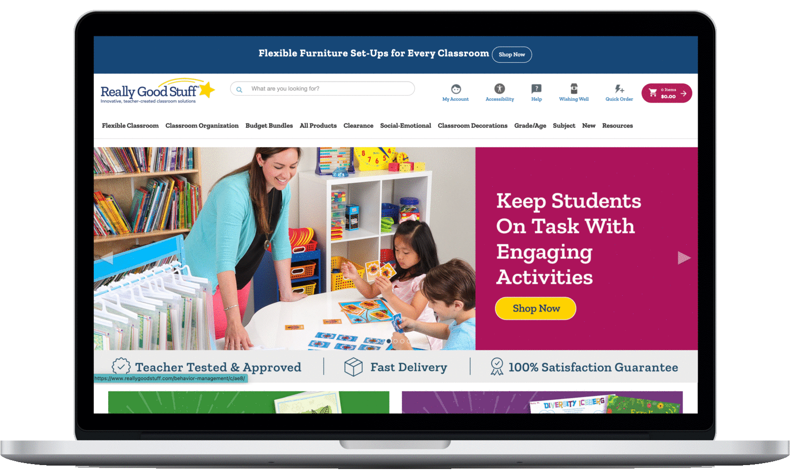
Prior to this Wishing Well project, RGS and DSS were just school supply e-commerce sites. Their dedication to providing classrooms with all the essential supplies is reflected in their extensive primary menu, pictured here. Its purpose until this point was to illustrate their vast inventory and make it easier for teachers to locate items. By adding Wishing Well to this large primary menu, it is possible for visitors and potential customers to miss this new feature.


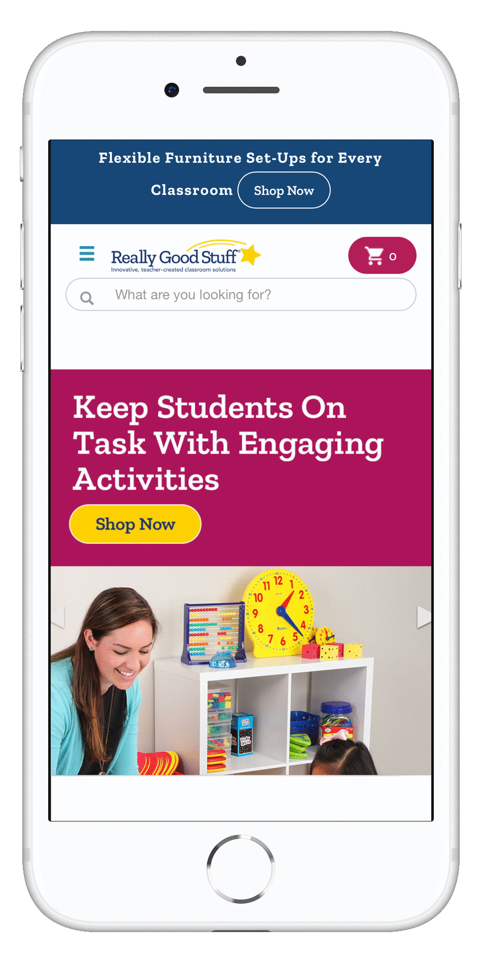

My proposed restructuring of the website's information architecture was to pivot the focus from inventory to calls-of-action. Pictured here in my proposal mockup, I have slimmed down the primary menu so that it features what a user can do - shop, sign in, create a wish list, or donate. The inventory facets have now been relocated to the secondary menu under shopping. This simplification of the primary menu quickly communicates to visitors what their options are and ensures the new Wish List application will be seen and explored.


As a website's features grow so does it's menu size. It can become necessary to revisit the menu structure in order to increase conversion rates by funneling users towards the desired actions. Another great way to introduce a new feature is with an enticing and informative landing page.


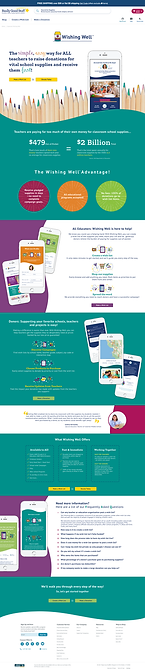
Leading up to the Wishing Well launch, I was asked to create a single scrolling landing page that would explain the new application for both donors and teachers. This was a fun challenge that allowed me to design an exciting marketing page that was on brand, informative, encouraged the visitor to continue scrolling, and made the potential Wishing Well user excited to try a new application. In working with the Project Lead and Creative director, we fine-tuned these pages until they were ready to hand off to our Developer for coding.


Wishing Well launched in July of 2021 and there are currently over 2,000 wish list nationwide. This was an extremely fun zero-to-finish project that I am so honored to have been a part of. I look forward to seeing how this new feature grows with each new version, and I hope it provides students and teachers with the quality supplies they deserve. Click on the images below if you would like to check it out for yourself. Thank you!


